THE CLIENT
We have been working closely with Taylor Walton solicitors for a year now, a Hertfordshire and Luton based solicitors, who are leading experts in both services for businesses and individuals.
Incorporated in 2007, the company has won many awards from organisations such as Hertfordshire Law Society, the Legal 500 UK, and The Law Society, for their great professionalism and dedication to their clients.
Our relationship with Taylor Walton has been based on our development of their SEO, web design and graphic design.
THE PROJECT
We recently completed a redesign of Taylor Walton’s family law page as part of our ongoing efforts to improve their overall site performance and SEO. Our Website & Digital Marketing Apprentice Jacob explains why we implemented the changes we did and the importance of the customer journey when restructuring page content.
THE WORK
Your website should be all about your customer journey. What do they want to do in what order? Where do they tend to click off? You should be constantly observing these metrics to see which part of you page is lacking, and what you can do to keep them on course to do business with you.
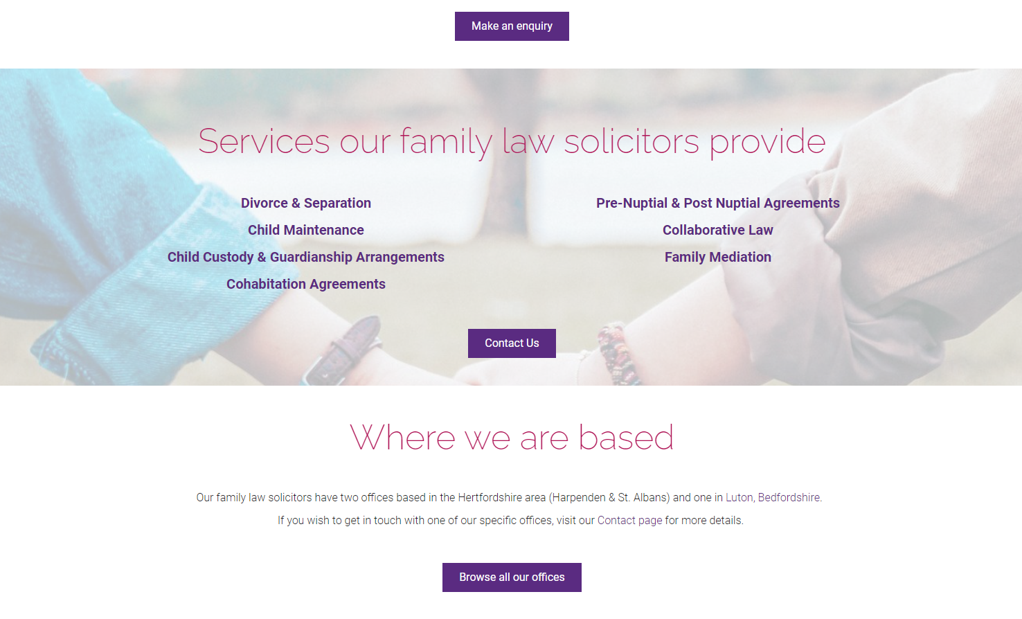
Implementing Multiple Call to Actions
For this reason, when we were redesigning one of our client’s (Taylor Walton) website, the most important thing for us was to implement multiple call to actions I.e. opportunities for the site visitor to execute the objective we had set for the page, which in this case was to increase enquiries for the family law team.
Having a contact form at the top of the page improves the chances of lead generation, as it makes it easier for the potential customer to get in touch without having to further navigate your site. The contact form at the top of the page also provides a great way to influence users and get their mind rolling about having a conversation with you, which will retain their interest for longer. We also added several ‘Get in touch’ buttons and links throughout the page copy, that drew the customer back to the contact form in the hope that it will eventually lead to a higher conversion rate from users to customers.
Considering Mobile Optimisation
An additional metric to consider is how many users are connecting from mobile devices, as this determines how well the page must display on a mobile device. If your website can’t be viewed through a mobile device well, you’ll be risking losing up to 70% of web traffic.
To optimise for mobile devices and desktops on the same webpage, we have to use something called responsive web design. This is code that allows for different settings to be followed dependant on the screen size being used.
To help the user navigate the website, we have used larger text over quantity of text, bold colours to help the words stand out on the screen. In addition to this we used large, pictographic boxes for the different services to aid the user in selecting the one they want to, as if the boxes are too small, irritation from incorrect selection will drive customers from your website.
Demonstrating Thought Leadership
We completed the final page structure with the inclusion of recent relevant blogs, as this not only will interest readers looking for family law services, but demonstrates Taylor Walton’s thought leadership and expertise in family law, as well as encouraging users to explore the Taylor Walton website further.
THE RESULTS
The updates to the website have seen the pages rank higher in Google and an increase in enquiries for family law services. Though it took a few weeks to get it right and for the effects to show, it proves that these things do work. Taylor Walton are very happy with the results, and we will be rolling out the changes across the website, optimising all the services pages in the same way.


