
As a musician, I find it difficult sometimes to keep a song stripped back to just one instrument and vocals. It’s so tempting to add some percussion, a bass line, a rhythm guitar, and before you know it, you’ve got twenty tracks. But sometimes, just one instrument is all you need. Think about Fast Car by Tracy Chapman, Hallelujah by Jeff Buckley or Someone Like You by Adele. Those songs are beautiful and so emotionally powerful precisely because they are built around remarkably simple arrangements, with the vocals and one instrument front and centre. If you added drums, bass and brass section, it’d lose the focus and the emotion would be buried under a wall of noise.
What has all this got to do with design, I hear you ask? Because in design, like in music, often less is more.
Designers don’t have musical instruments, but they do have an arsenal of design elements that can be used and combined. Fonts, colours, images, icons, calls to action. All of these things are important, but they must be handled with care.
Design is about hierarchy, not decoration
Most people assume the job of design is to make something look nice, but it’s about something far more important. The job of a design is to communicate the intended message in a way that is both eye catching and easy to understand. First, you need to grab their attention, make the design stand out so they look at it in the first place. Then it needs to be presented in a way that the audience is able to see all the important information clearly and understand it. For both of these, we need what is known as hierarchy.
When we look at things, our eyes follow a natural path without us even thinking about it. And as designers, it’s our job to guide the audience’s eyes. So, a good design will do something like:
An image to catch the attention -> a headline to concisely tell the audience what this is about -> a description to provide more information -> a call to action to tell them what to do next
Let’s look at an example. This is not an award-winning design by any means, but it should prove to you how this process works:
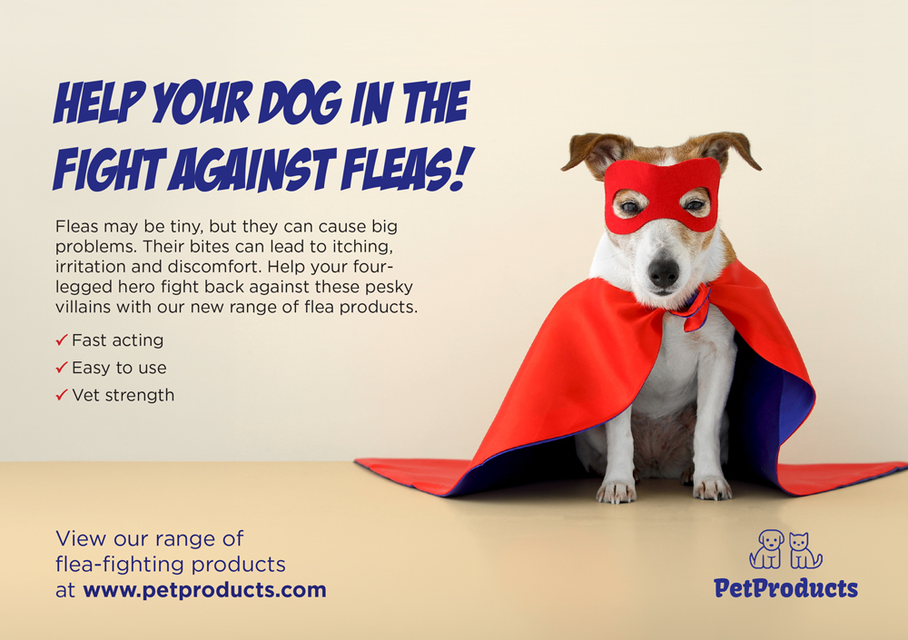
Firstly, you’re drawn to the dog. It’s a familiar cute dog, but dressed as a superhero. Then you go to the headline, which tells you straight away that it’s about fleas. If you have a dog, you will likely be interested, so you read the copy underneath to see what it’s about, and the main benefits are clearly highlighted . Then, if you like what you read, you naturally follow it down to the call to action to find out more. And then finally you see the logo to tell you who the advert was for.
So, now what happens if we remove this hierarchy?
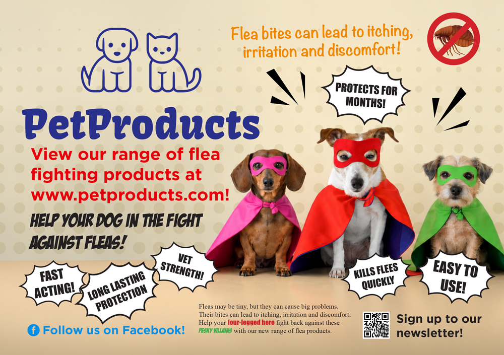
Firstly, this was painful for me to design! It’s an exaggerated example that I hope nobody would ever green light for print, but as you can see, the hierarchy is gone. The logo and the dog are competing for attention, so your eyes go to the logo and realise it’s trying to sell you pet products, so you switch off. The call to action is now the second largest piece of copy, right after the logo, so you’re being told to buy something without knowing what it is or why you should buy it. The catchy headline is lost in the copy surrounding it, so the superhero theme doesn’t make sense until you find it. The benefits are scattered all over the page, so you have to search for the reasons why to buy the product. And the reason why you would need the flea products is hidden in the small copy at the bottom.
Overall, the advert does not have clear focal points, so your eyes don’t know where to look and end up just seeing it as a mess of information and you give up. Let’s look at some more reasons why it fails.
White space isn’t wasted space
A technique that designers use to help draw the eye to certain places is called “white space”. This is not literally white space, but empty space around objects to help them stand out.
With the recent trend of minimalist design, this has become far more obvious, with companies like Apple using it to great effect. Their posters often feature just a phone with lots of empty space around it and a large headline. Their website matches this aesthetic, with lots of padding around images and text. It may look bare, but it works. It draws your eye directly to the product or headline, with nothing else to distract you.
Without white space, elements blend into one another, making it look like one block of content rather than individual pieces of information.
If we look at the earlier flea product advert, the dog becomes the focus because it has room to breathe. There’s empty space around it, so it stands out. The benefits are easy to find because they are given room to breathe by the space to the right of the bullets. The same with the call to action and logo, they don’t get lost. They’re clearly visible.
White space also gives designs a premium feel, because it exudes confidence. It says “We know our product is good, we don’t need to fill the whole page to try and convince you.”
It may feel like wasted space, real estate for an extra bit of information or another picture to go, but not every area of the canvas needs to be filled. Space is itself a design element.
One strong image is better than several mediocre images
Imagery is just as important as copy when it comes to engaging audiences. Another temptation for designers can be to add several images to show a diverse range of people, several shots of the product to show it off from all angles, or multiple scenes to show the different ways their service can change your life. But sometimes, too many images can do more harm than good.
This goes back to hierarchy. If there are too many images, they each lose importance and the audience doesn’t know what to look at first. The different messages they are trying to convey all get lost and it becomes just decoration rather than a statement. However, one bold image can catch an audience’s attention and communicate the message clearly.
Let’s go back to our flea product advert. The single dog on his own draws your attention and communicates the theme straight away. It’s for dogs, and it’s about fighting something or being strong. Compare this to the second advert. Yes, three cute dogs are better than one. But in terms of communication, the two extra dogs add nothing. If anything, they add more questions. Are the products only for small dogs like these? Are there different products for different breeds? Is this for people with more than one dog?
It’s not always easy to find the right image, but if you do, it can be very powerful.
It’s not just what the words say, it’s how they look too
The choice of fonts in a design can completely change the vibe and influence the audience’s perception of a brand. For example:
- A clean sans serif font = bold and modern
- A smart serif font = corporate and experienced
- A handwritten font = authentic and personal
- A decorative font = fun and friendly
But it’s not only the type of font that is important. It’s also the number of fonts you use. In general, a brand will have two or three typefaces that they use, usually a legible font for the body copy and a more stylised font for the heading.
If designers stray from these fonts and start using different typefaces, it makes the brand less consistent and less professional. If more fonts are used, it gives the impression that there is no set style, and the different sections of copy do not work together.
This also includes font weights and styles. A bolder or italicised version of the font can be used, but should be used sparingly for emphasis.
The font size is also important, and this again goes back to hierarchy. There should be a clear distinction between main heading, subheading and body copy. This subtly tells the audience which to read first, meaning you can craft your message accordingly.
Looking at the flea product advert, the heading uses a comic book style font to match the image of the superhero dog, while the rest of the copy uses a sans serif font for easy legibility and a modern feel. Meanwhile, the second advert has 5 different fonts (plus the logo font) so it looks like several non-designers have added bits on separately.
A limited palette can be more colourful
As with fonts, there are lots of colours for us to choose from. It can often be tempting to use lots of different colours to make a design pop and look nice and colourful. But colour should be used wisely.
Good brands will have a specified colour palette, with a main accent colour that is associated with their brand (think Cadbury purple, easyJet orange or Starbucks green), one or two complementary colours that work well with the main colour, and an accent colour that contrasts with it to stand out. This helps the audience recognise the brand straight away without even having to read anything or find a logo.
Let’s look at the flea product advert again, which uses a palette limited to four colours: blue, red, yellow and black, with various shades of these colours. The blue comes from the brand’s logo, the yellow background complements the blue, the black makes the text legible on the yellow background, and the red contrasts with the blue to draw your eye straight to the dog. The dog also has brown and white fur, with the brown matching the yellow and the white helping the red pop. The red is also used on the ticks of the benefits to help them stand out.
By contrast, the second advert uses so many colours that everything stands out at once. There is no brand consistency, so without seeing the logo you wouldn’t know what brand this advert is for. Even the blue for the Facebook call to action is a different shade.
As with white space, a limited palette gives the audience confidence that this is a serious company with a consistent brand that they know how to use, rather than a company with a marketing department that just got a new pack of crayons.
Tell them exactly what you want them to do
Design is often not just about informing an audience, it’s also encouraging them to do something – usually buying a product or service, but it could also be subscribing to a newsletter, following on social media, or something else entirely.
A strong design should have one clear call to action, so the audience knows exactly what to do next. Multiple calls to action will confuse the audience and make them unsure of which one is most important. If the next step is not clear, they will likely end up doing nothing at all.
In the flea product advert, there is one clear call to action: visit the website. In the second advert, there are three: visit the website, follow on Facebook, and subscribe to the newsletter. And because they all look different and are spread around the advert, it’s not clear which is the most important.
It may seem like a good idea to offer alternatives, but this risks losing an audience rather than gaining one.
Conclusion
Design is everywhere these days. People encounter designs while scrolling social media, opening emails, walking past signs, browsing websites or flicking through brochures. And they rarely study every element carefully. So, it’s important to capture and retain their limited attention.
Before you even start designing, think clearly about:
- The precise message you want to convey
- How you can present it as concisely as possible
- What tools you can use to grab (and retain) the audience’s attention
Once you’ve done a first draft, look at it and think to yourself, “Do I really need all of this?” Then experiment with removing elements. If you remove something and the message is still clear, you probably didn’t need it in the first place.
Good design, like good music, isn’t about using every tool at your disposal. It’s about knowing which ones the piece actually needs – and, sometimes, knowing when not to play at all.
So, there you have it. A 2,000 word blog explaining why less is more. Easier written than done!
